City of Raleigh logo
Yesterday, the City of Raleigh approved its very first logo after working on it with a design firm for a year. Initially I was not so sure about the design since it appeared to be very antiseptic. As I’ve studied it more it’s grown (so to speak) on me a bit.
My comments is that the tree resembles the hated Bradford Pear rather than an oak that is part of our “City of Oaks” nickname. Nothing says quality like a smelly, brittle tree that collapses with the slightest breeze! The logo is also a bit more angular than I would prefer. Too many sharp edges, like a pile of green razor blades.
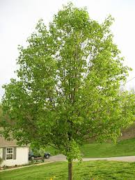
Bradford Pear
But you know what? My opinion doesn’t really matter. I wasn’t involved in the process, I’m not a design professional, and I don’t have a vote at the table. No one logo is going to please everyone and I applaud the Council for bravely making the change. I would consider anything an improvement over using the Raleigh City Seal on everything as the seal was never meant to be used as a logo. Any logo is better than no logo at all (i.e, the seal), so I’m happy that Raleigh has something it can now use. If the Council decides in 10 or 15 years that it is ready for something new, it will at least have something to build on.
I can live with it. Not bad for a first try.
Now if Raleigh can refresh its flag…